
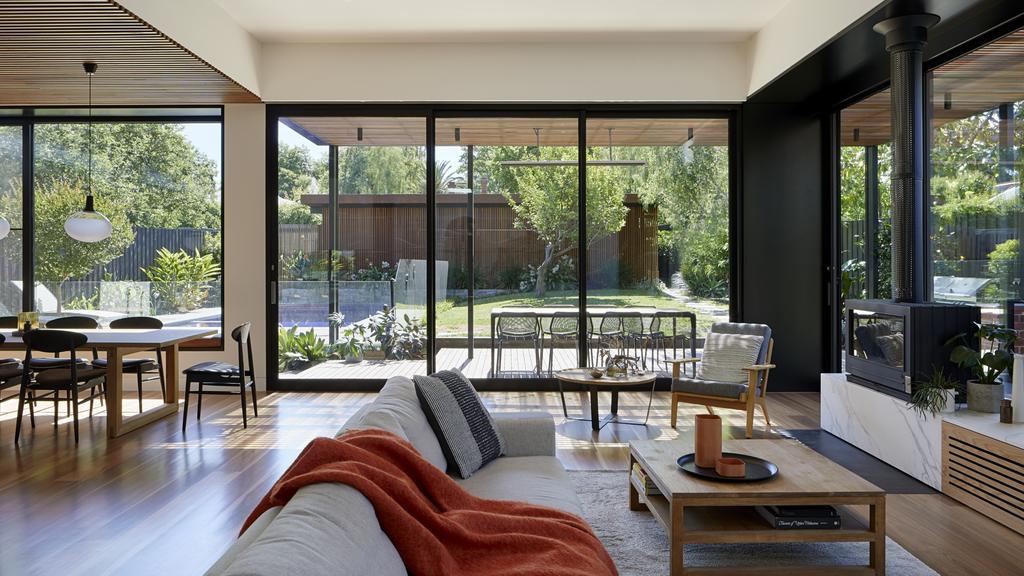
Walls of windows bring the outside and natural light in. Photo: Tatjana Plitt
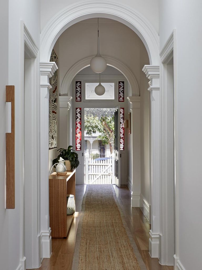
When the owners of this Camberwell period home bought it a few years ago, they were partly drawn by the large floorplan.
But it’s safe to say they weren’t attracted to the layout, as spaces were awkwardly composed and there was no connection to the outdoors. A designated dining area was also missing, and a ’90s extension at the back wasn’t appealing.
So the professional couple, who share the house with their teenage daughter and their dog, Maisie, decided to renovate in stages.
RELATED: House designed with the cat in mind
Olinda house by Bent Architecture an eco wonder one with nature
Point Lonsdale house short-listed for multiple awards quick to sell
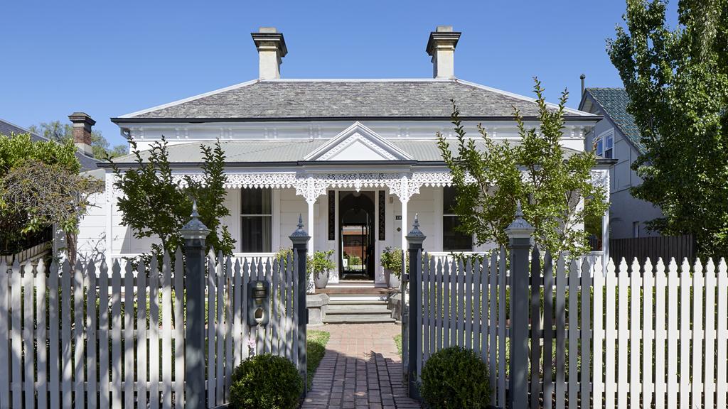
Period charm from the street. Photo: Tatjana Plitt
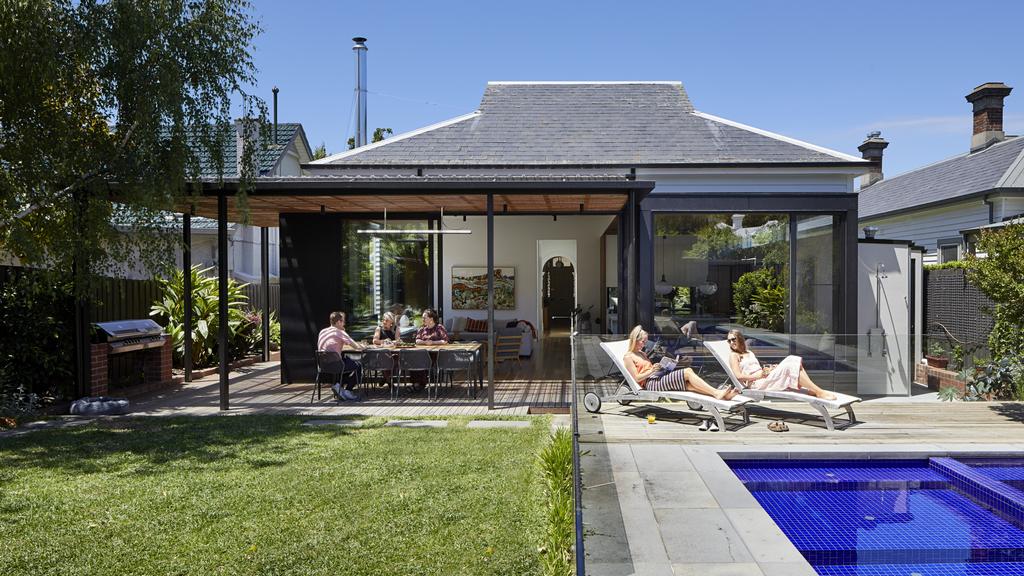
Modern luxury out the back. Photo: Tatjana Plitt
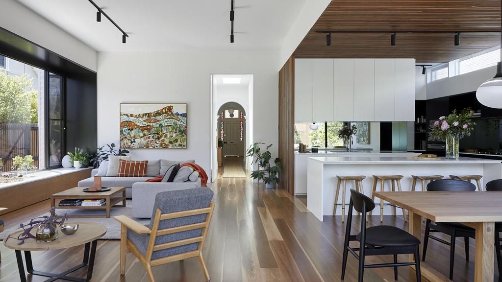
When architect Sandi Kuzman, of Kuzman Architecture, came on board for the final leg of the project, part of her design work involved gutting everything under the roof line at the rear of the house to create a new living and entertaining zone.
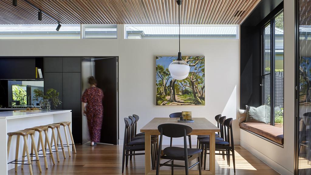
“The living area is quite large now,” she said. “But it has a few cosy nooks — such as the window seat that overlooks the pool — to create moments of interest, rather than having a big open space you feel lost in,”
Here, Ms Kuzman shares some of the top ideas from this smart renovation.
Slick use of black on the walls between the windows. Photo: Tatjana Plitt
Let the light shine in. Photo: Tatjana Plitt. Artwork: Sophie Perez
All fired up
The rear of the house featured so much glass, including floor-to-ceiling windows and sliding stacker doors, it became tricky to find a spot for an important item on the owners’ wishlist: a fireplace.
Ms Kuzman said a solid fireplace would have blocked natural light and a beautiful view of the garden. So, a double-sided unit, with glass to the front and back, was chosen, providing an uninterrupted connection with the outdoors.
“Even when the fireplace is not on, it’s a talking point, because you can see right through it to the garden,” Ms Kuzman said.
A contemporary timber-lined ceiling. Photo: Tatjana Plitt. Artwork: Sophie Perez
From the old to the new. Photo: Tatjana Plitt. Artwork: Stewart Westle
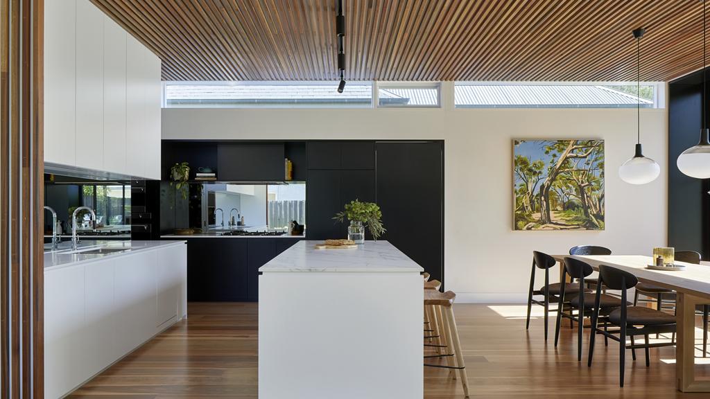
Mirror image
The best layout for the kitchen meant the owners would have their backs to the garden when they were washing the dishes, which they didn’t want.
Ms Kuzman tackled this stumbling block by using a large mirrored splashback behind the sink.
“This way, the splashback would reflect a view of the pool and the garden so the owners could still see outside and watch kids playing in the water,” she said.
A mirrored splashback was also installed behind the cooktop to capture another garden view.
“Wherever you stand in the kitchen, you have some connection to the greenery outside,” Ms Kuzman said.
Who doesn’t love a window seat? Photo: Tatjana Plitt
Clean lines. Photo: Tatjana Plitt
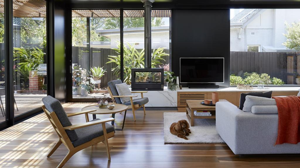
Black magic
Black has been used to highlight some of the new design elements, frame views and create zones.
“It accentuates features like the window seat, for example, as an area to relax and read a book,” Ms Kuzman said.
She explained the generous amount of natural light in the space meant the black features didn’t make the space foreboding.
“Because we have an abundance of natural light from the large expanses of glazing, we were able to introduce black to create drama and intimacy without making the space dark,” she said.
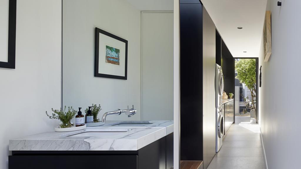
A wall of black joinery in the kitchen has effectively zoned one of the work areas and also conceals the entry to the laundry and powder room.
“The owners wanted a powder room near the dining area, but didn’t want it to be obvious, so the door was designed to blend in with the joinery,” Ms Kuzman said.
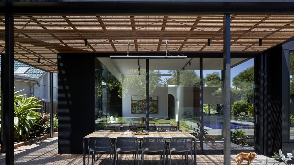
What a place to entertain in summer. Photo: Tatjana Plitt
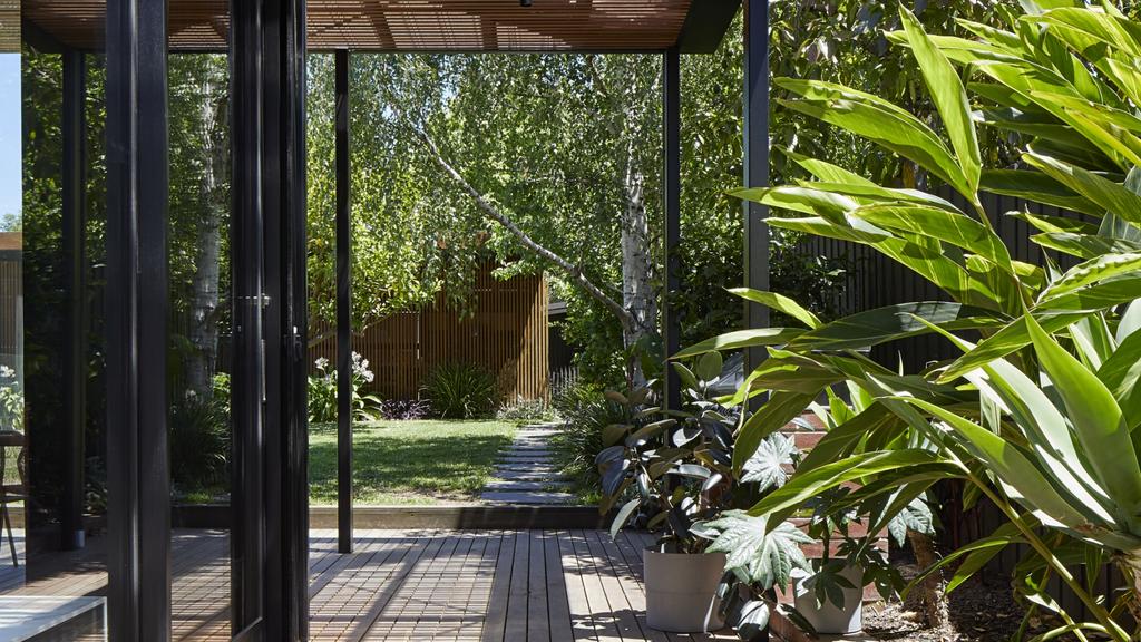
Lush aspects. Photo: Tatjana Plitt
Vanity fair
Faced with a long, narrow powder room, Ms Kuzman devised clever ways to make the space feel bigger. They included mounting the vanity on a mirror that stretches from the floor to the ceiling.
“By using such a large mirror, we can bounce light around more to brighten the place up,” Ms Kuzman said. “And centring the basin so it’s not touching any walls or the floor really opens up the space around it.”
The long mirror is also handy for people to get dressed after a swim, with the powder room doubling as a change room for the pool.
Elegant arches. Photo: Tatjana Plitt
Timber treat
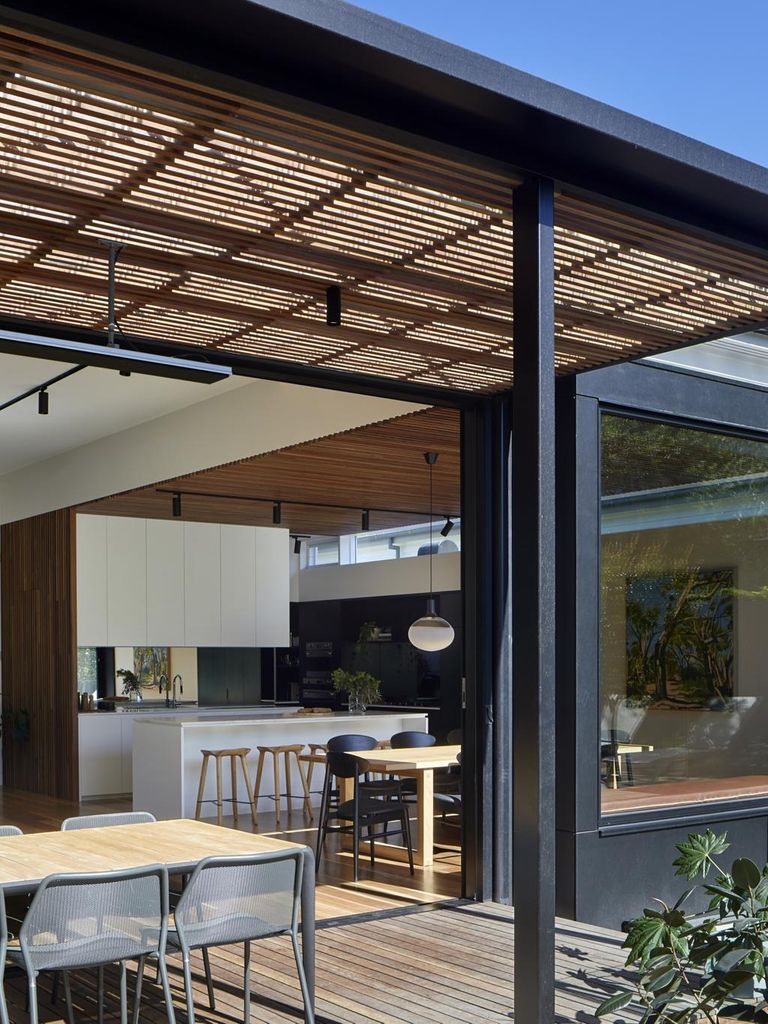
Ms Kuzman said slim timber battens were used on the ceiling above the kitchen and dining area to give this area greater identity within the open plan.
“They bring in a layer of warmth and texture and offer a refreshing break from plain white plasterboard,” she said.
Floor-to-ceiling timber battens were introduced to conceal a service cupboard near the kitchen and screen the sink from the living area.
Ms Kuzman said battens were also used for the roof of the wraparound veranda at the back and side of the house, to subtly blur the boundaries from inside to out.
“They make the spaces feel so much better connected and we get beautiful variegated light coming through into the house,” she said.
Indoor-outdoor flow. Photo: Tatjana Plitt
MORE: Richmond two-storey Victorian house ‘like wearing cashmere’
Caulfield South Art Deco pad has business up front, party out back
Why a Box Hill vendor turned down offer $200k above reserve
The post How a Camberwell period home became a modern entertainer appeared first on realestate.com.au.